

22 Nov From Paper to Digital: When a Wireframe Is Ready for the Screen
Part 9 of Build Wireframes and Low-Fidelity Prototypes — a series on the UX principles I use in client work.
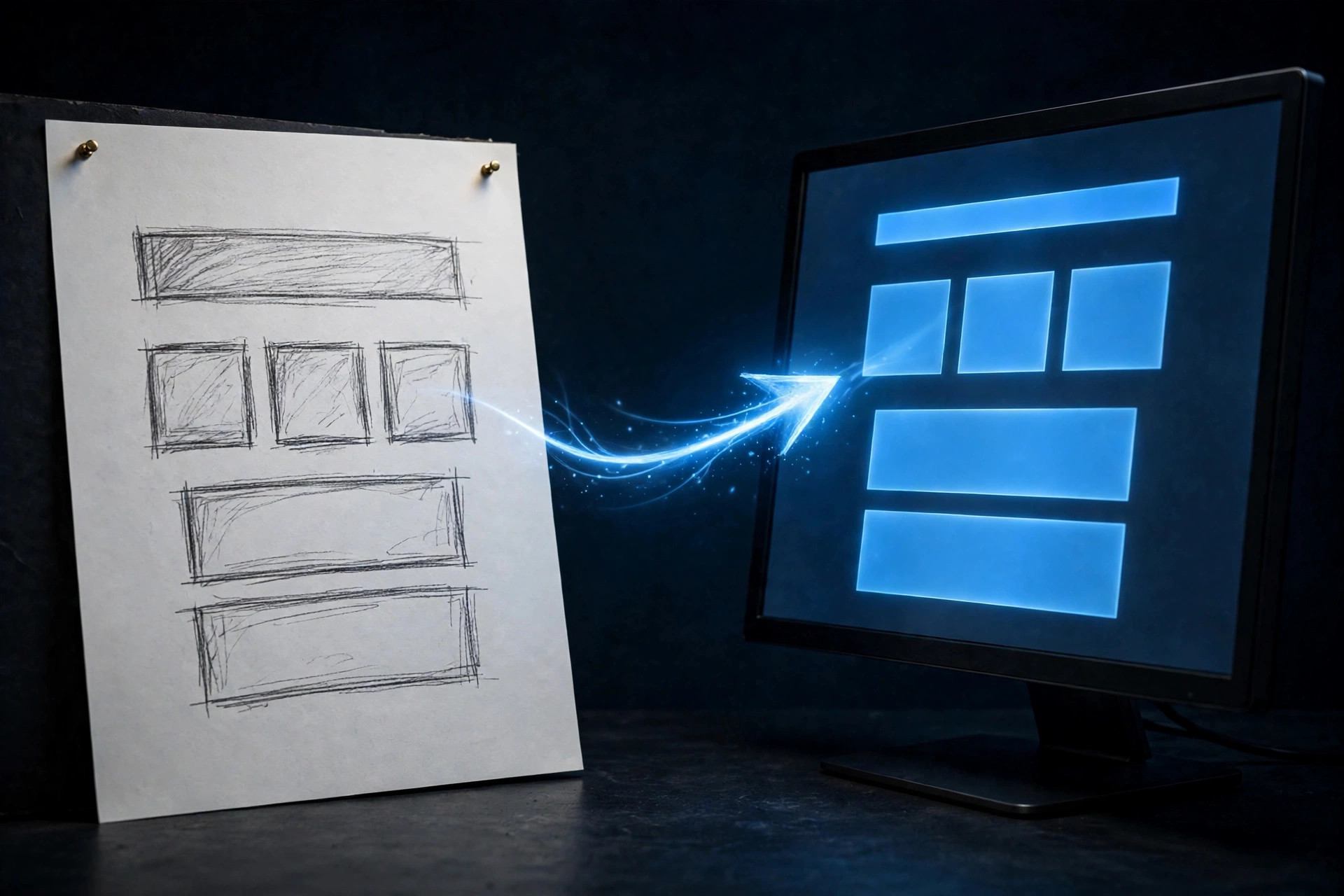
Paper wireframes are for exploring. Digital wireframes, on the other hand, are for getting the structure right. Knowing when to move from one to the other is a judgment call. Getting it wrong costs time in both directions. For example, move too early, and you polish a structure you never settled. Move too late, and you keep redrawing by hand what a digital tool could now hold steady. Therefore, there are three questions I ask before I make the move. If I cannot answer yes to all three, I stay on paper a little longer.
Three questions before you move
First: is the paper wireframe complete? Complete does not mean finished. Moreover, it does not mean beautiful. It means you know what structure you want. You know what belongs on the screen, in what order, and what each element is for. A wireframe with a blank area labeled “something goes here” is not complete. For example, the wireframe with a rough box labeled “schedule list” is complete enough. You have made the structural decision: there is a schedule list, and it sits here.
Second: has the paper wireframe had feedback? By this point, someone other than you should have looked at it. A colleague, a client, a friend who matches the visitor you are designing for. Paper invites honest feedback precisely because it looks unfinished. People will call a sketch confusing. They will not say the same about a polished screen. If nobody has pushed back on the paper version yet, the digital version will simply be cleaner. It will still rest on untested assumptions.
Third: are you ready to think about basic visual cues? Color and photography still do not belong here — those come much later, with prototypes and final design. But at the digital stage, you do start to vary the text itself. Use real headings where headings belong. Use real labels where labels belong. Save placeholder text for long stretches of body copy that nobody has written yet. You move from scribbles that stand for text to actual words where the words matter. In other words, that shift is the sign that the structure is solid enough to carry real content.
What changes when you go digital
The first change is precision. On paper, messiness was a feature: it kept ideas moving and nobody mistook a sketch for a promise. Digitally, however, the goal changes. Now the structure needs to be right, and right means clean. That means consistent spacing, aligned boxes, and the same treatment for the same element on every screen. As a result, a digital wireframe that is still messy has lost paper’s excuse without gaining digital’s advantage.
The second change is the words. Therefore, use real text for the pieces that carry meaning. Above a list of events, write what that list actually is. Use the real heading, not a line that stands for a heading. In addition, below an icon, write the real label, so nobody has to guess what the icon does. For long paragraphs that do not exist yet, placeholder text is fine. It is honest, too: it shows where words will go and how much room they will take. It does not pretend someone already wrote the words. The rule is simple to remember. Use real words where the words decide the action. Use placeholder where the words are just taking up space.
Restraint and sharing
The third change is restraint. Hold back on color and images. A digital wireframe is not a nearly-finished design that happens to be grey. It is still a wireframe, and its job is still function. Does this screen have what it needs, in the right order, with every element earning its place? Adding color and photography now would answer a question nobody has asked yet: “does this look good?” It would drown out the question that matters: “does this work?” Instead, wait until the prototype stage for expressive detail. The wireframe’s job is to be clear, not pretty.
The fourth change is sharing. A digital wireframe is far easier to share than a stack of paper. A link reaches a client, a colleague, or a stakeholder in seconds. In addition, they can look at the same screens you are looking at, in the same order. You do not need to photocopy anything or carry paper to a meeting. That shareability is also why digital wireframes need to be clean. The moment you send a link, the wireframe stops being a private sketch. In other words, it becomes a shared picture of the plan. It should read clearly to someone who never sat in the room while you drew it.
Keep the paper, even after the move
Going digital does not mean throwing the paper away. So keep the paper wireframes, photographed and filed with the project. They show the exploration: the five versions, the starred parts, the discarded ideas. A client can also see that someone chose the digital version rather than merely drawing it. They also belong in a portfolio for exactly that reason. A finished digital wireframe proves you can draw cleanly. The paper behind it proves you can think.
The move from paper to digital is not an upgrade in the sense that digital is better. Instead, it is a change of job: from exploring many ideas cheaply to settling one structure cleanly. Paper asks, “what could this be?” Digital asks, “is this the structure we are committing to?” Answer the three readiness questions honestly. Then you will know which question you are asking. You will also know which tool belongs in your hand.
The next post takes the next step in that same journey. It turns wireframes, still on paper, into something a visitor can actually try.
Want your site’s structure sketched before it’s built? Shaun M. Johnson, owner of Signature Web Design is a full service Web designer, SEO, UI/UX, Graphic Design, and Logo and Branding Expert serving Goldsboro, Greenville, Kinston, Raleigh, Wilmington, Wilson and surrounding areas in North Carolina — with websites designed across the country. Get a free consultation or see recent work.
Previous in this series: Gestalt Principles · Next: Paper Prototypes: Cut It Out and Try the Journey