

19 Nov Paper Wireframes: Draw Five Versions, Then Keep the Best Parts
Part 6 of Build Wireframes and Low-Fidelity Prototypes — a series on the UX principles I use in client work.
A wireframe on paper looks unimpressive, and that is exactly why it works. Nobody mistakes a pencil sketch for a finished website, so nobody defends it the way they defend a polished design. You can draw it in minutes, throw it away without grief, and draw a better one. That freedom is the whole point of paper wireframes: they let you explore a lot of ideas before any of them cost real money.
Paper is also the fastest way to get an idea out of your head. A few lines, squares, and circles on a plain sheet will beat an hour in a design tool, every time, when the question is still “what could this page be?” You need a pen and paper, nothing else. No software, no account, no learning curve. And because it is fast and cheap, you can afford to be wrong four times before you are right once — which is usually how good layouts happen.
Start with a list, not a drawing
Before I draw anything, I write a short list of what has to be on the page. This step sounds boring, and skipping it is the most common paper-wireframe mistake. Without a list, you draw a handsome layout and then discover, halfway through, that you forgot the phone number, or the donate button, or the way back to the homepage. With a list, you check each sketch against it and nothing important goes missing.
Take a festival homepage. The list might read: event name and dates, a schedule button, a “what’s happening now” section, parking information, a way to get tickets, and a footer with contact details. Take a church homepage. The list might read: service times, a plan-your-visit button, a welcome message for first-time guests, and a way to ask a question. Take a nonprofit homepage. The list might read: what the organization does, a donate button, a volunteer button, and a recent story that shows the work in action.
The list comes from the research and the flow, not from taste. It is the promise the page has to keep. Everything after this is just arranging that promise in different ways.
Draw five versions of the same screen
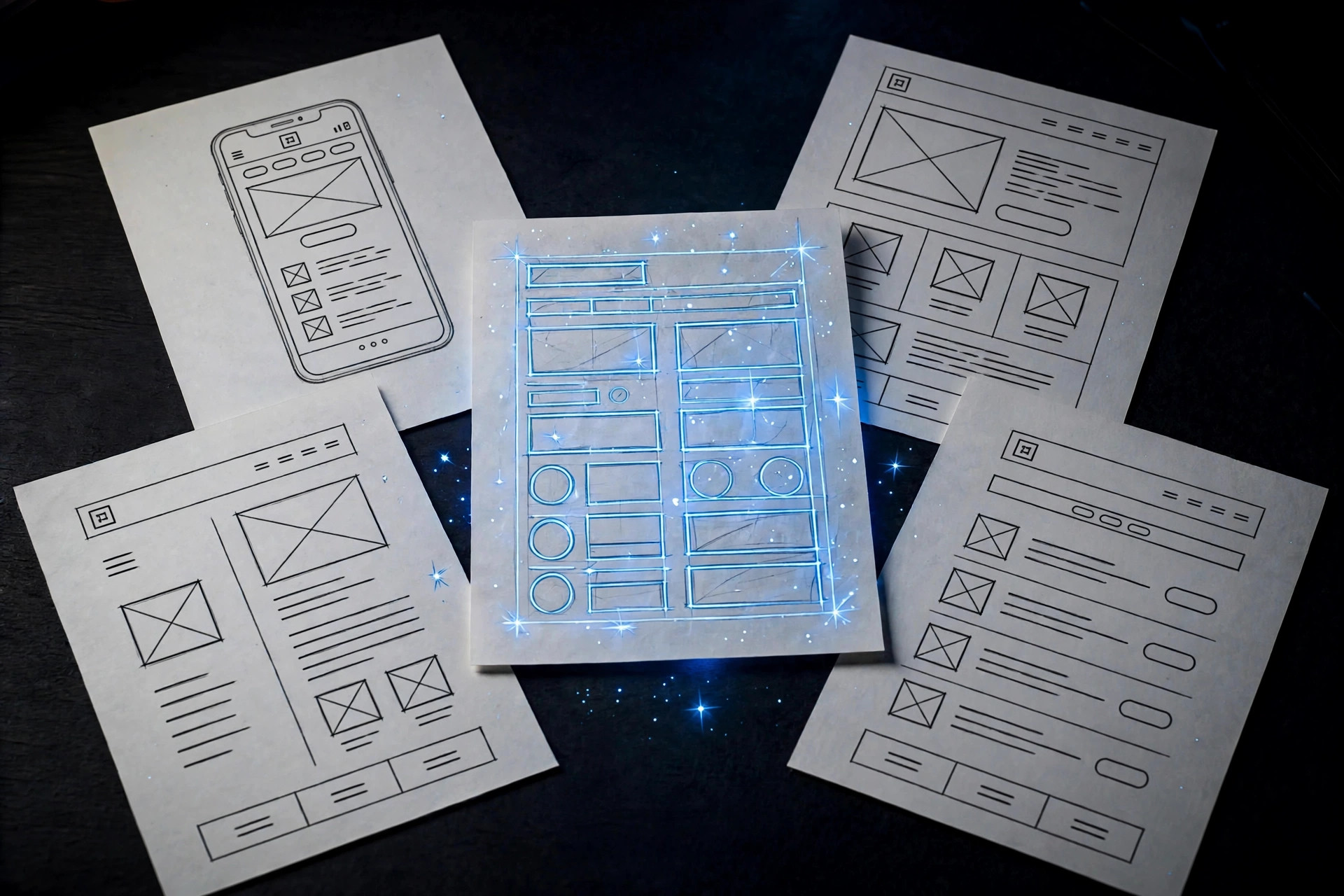
The rule I use is simple: draw at least five different versions of the same screen. Not five screens — five versions of one screen. That distinction matters. Drawing five different pages feels productive, but it avoids the hard question. Drawing five versions of the homepage forces you to confront it: there are many ways this one page could work, and the first way you thought of is rarely the best.
So I draw quickly, a couple of minutes per version, and I do not worry about neatness. In one version, the schedule might run down the left side as a list. In another, the day’s highlights might sit in three big sections across the top. In another, the most important action — get tickets, plan a visit, donate — might take up most of the screen, with everything else tucked underneath. One version will probably look ridiculous. That is fine. Ridiculous versions are how you find out which ideas are actually new and which are just the first idea repeated in a different font.
As I draw, I keep the elements list beside me and tick things off. A version that forgets the parking information is not a contender, however pretty it looks. A version that includes everything, but in an order nobody would follow, is not a contender either. The list keeps the exploration honest.
Star the best parts, then combine them
Once the five versions exist, the work changes from inventing to judging. I go through them and put a star next to the parts I like most — not whole versions, but parts. The top bar from one version. The way another version groups the day’s events. The clear, single action from a third. Most versions will contribute something, and most versions will also contain something worth dropping.
This is where paper wireframes earn their reputation for saving arguments. When a client sees five versions with stars on them, the conversation stops being “do you like my design?” and becomes “which of these parts actually helps the visitor?” A top bar that appears in four of the five versions is telling you something: it probably belongs. A clever section that appears in only one version, and that nobody can explain in one sentence, is telling you something else.
Then I combine the starred parts into one refined wireframe for that screen. That refined version is the one that moves forward — not because it won a beauty contest, but because each of its parts survived a comparison. It is the first draft, not the final design, and it should still look like a sketch. If it already looks finished, you have probably started styling too early.
Repeat for the flow, and keep the sketches
One refined screen is not a website. I repeat the process — list, five versions, stars, refined version — for the other screens the user flow needs, working through the sitemap in order: the homepage first, then the main sections, then their sub-pages. The sitemap keeps the work organized and shows you, at a glance, which pages you have wireframed and which you still owe. Chopping a big project into sitemap-sized pieces is also how a big project stops feeling big.
And keep the paper. Photograph the sketches, all of them, not just the refined one. The five versions plus the refined version tell a story a single polished screen cannot: that you explored, compared, and chose. That story is useful in a portfolio, useful with a client who wonders why a layout looks the way it does, and useful to you six months later when someone asks why a section sits where it sits.
Paper wireframes will not answer every question. They will not tell you how a page should look, and they are not supposed to. What they tell you, cheaply and early, is what belongs on a page and in what order — and that answer, settled on paper, makes everything that comes after it, digital wireframes included, faster and calmer.
The next post looks underneath the wireframes, at the map that decides which pages exist at all: information architecture.
Want your site’s structure sketched before it’s built? Shaun M. Johnson, owner of Signature Web Design is a full service Web designer, SEO, UI/UX, Graphic Design, and Logo and Branding Expert serving Goldsboro, Greenville, Kinston, Raleigh, Wilmington, Wilson and surrounding areas in North Carolina — with websites designed across the country. Get a free consultation or see recent work.
Previous in this series: Putting It Together · Next: Information Architecture: The Map Under Your Website