

18 Nov Putting It Together: Storyboard, Flow, and Wireframe on a Real Project
Part 5 of Build Wireframes and Low-Fidelity Prototypes — a series on the UX principles I use in client work.
So far this series has treated storyboards, user flows, and wireframes as separate tools. In real work, they are not separate. They are one process, in order, each one feeding the next. This post walks through that process on a single project, so you can see how the tools connect — and why skipping one leaves a hole the next tool cannot fill.
I will use a composite example drawn from the kind of projects I actually build: a community event site, a church site, and a nonprofit site, blended so no single client is exposed and no result is invented. The steps are the steps I follow. The details are the kind of details that come up every time.
Step one: tell the visitor’s story
Start before screens, with a storyboard. Pick one visitor and one job. For our composite, pick the festival attendee on event day: a parent, in the car, trying to find today’s schedule and parking before the gates get busy.
Write the four ingredients first. Character: that parent. Scene: the car, phone in hand, in a hurry. Narrative: last year parking information was hard to find, and the family circled the lot. Plot: this year the site puts today’s schedule and parking together, clearly, so the family arrives on time feeling welcomed rather than stressed.
Now draw six panels. Panel one sets the scene. Panels two through five move the story forward, marking feeling along the way — worry, relief, confidence. Panel six ends with the goal achieved. If the story does not move you, stop. The design will not move visitors either. A storyboard that leaves everybody cold is telling you the idea is not ready, and that is valuable news while it is still free.
This is also where the big-picture and close-up distinction earns its keep. The big-picture storyboard above is about the visitor. The close-up version, drawn next, is about the product: open the site, today’s schedule leads, filter by stage or time, tap for details and parking, save or share, and land on a clear summary with a next step. Same visitor, same job, different lens. The first lens tells you whether the idea matters. The second tells you how it will work.
Step two: map the path
Turn the close-up storyboard into a user flow. Same job, now in shapes: circles for actions, rectangles for screens, diamonds for decisions, arrows for direction.
Landing screen. Action: find today’s schedule. Decision: which stage or time? Details screen. Action: check parking. Decision: is parking clear? If yes, done — with a summary and a next step. If no, branch back to a clearer parking view, not to the homepage to start over. Count the steps. If landing to schedule takes more than a couple of taps, the flow is telling you something the storyboard hinted at: the path is too long for a visitor in a car.
This is also where you catch the dead ends. Does every screen end with a next step? Does every decision have a sensible branch for “no” as well as “yes”? Does the flow handle the visitor who arrives from a social media link instead of the homepage, and lands mid-journey? A flow that only works from the homepage is a flow that fails half your visitors.
For an existing site — which is most of my redesign work — this step is diagnostic. Draw the current flow as it actually works today, not as it should work. Then draw the new flow beside it. The difference between the two drawings is the redesign brief, in a form a client can understand at a glance. No jargon, no page-by-page audit report, just two maps: where visitors get lost now, and where they will not get lost next.
Step three: skeleton each screen
Now, and only now, draw wireframes — one per rectangle in the flow. For each screen, work the checklist from the last post: re-check the research and goals, name the inputs and outputs, sketch from the flow, then build the structure with boxes, lines, and X’s.
The homepage wireframe, for our attendee, leads with today’s schedule — because the storyboard said the visitor is in a hurry, and the flow said schedule is the first job. Parking sits beside the schedule, not three pages deep, because the storyboard named parking as the worry. The details wireframe has the event information, the parking information, and a clear action — save, share, or back to the schedule — and nothing that competes with those three jobs.
Then check each wireframe twice: are all necessary elements included, and are any missing or misplaced? A wireframe that passes both checks is ready to show. A wireframe that fails either check goes back to the storyboard or the flow, not forward to styling. That rule — fix the structure before you style it — is the single most money-saving habit in this whole series.
What you hand over, and what comes next
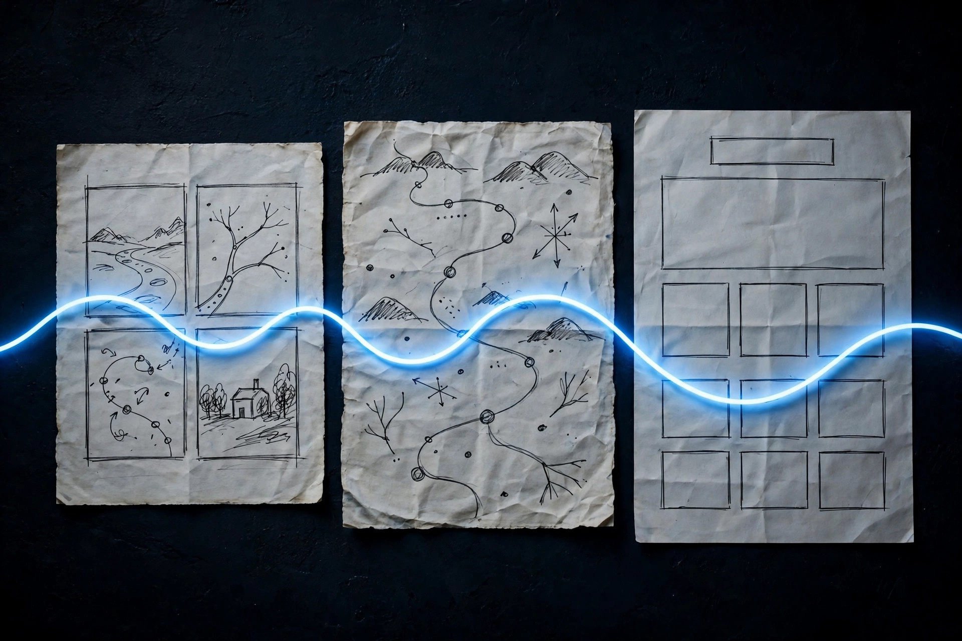
At the end of this process, you have three artifacts that tell one coherent story: a storyboard a non-designer can retell, a flow a developer can build from, and a set of wireframes a client can approve without guessing what the finished site will look like. Together, they answer the three questions every website project must answer before building: does this help a real visitor, in what order, and with what on each screen?
What you do not have yet is a clickable prototype — wireframes you can actually tap through — or a digital version in a design tool. Those come next in this series: paper and digital wireframes in more depth, then low-fidelity prototypes, first on paper and then digitally. This series, for now, stops at the paper stage on purpose. Paper is where structure gets decided, and structure decided on paper is structure that survives contact with real visitors.
If you take one habit from this series so far, take this order: story, then path, then skeleton, then styling. It feels slower than jumping to a layout. It is not. It is the fastest route to a site that works, because it spends the cheap effort — drawing, mapping, sketching — before the expensive effort of building, and it catches the expensive mistakes while they are still erasable.
The final post in this series is personal: what sketching before building actually changed in my own process, on real client sites, and why I still start on paper even after years of building websites.
Want your site’s story, path, and skeleton worked out before it’s built? Shaun M. Johnson, owner of Signature Web Design is a full service Web designer, SEO, UI/UX, Graphic Design, and Logo and Branding Expert serving Goldsboro, Greenville, Kinston, Raleigh, Wilmington, Wilson and surrounding areas in North Carolina — with websites designed across the country. Get a free consultation or see recent work.
Previous in this series: Wireframes · Next: Paper Wireframes: Draw Five Versions, Then Keep the Best Parts