

21 Nov Gestalt Principles: Why Visitors Group What They See
Part 8 of Build Wireframes and Low-Fidelity Prototypes — a series on the UX principles I use in client work.
Have you ever opened a website and known, instantly, which things belonged together — which button went with which paragraph, which items were a set, which bar was the navigation — without reading a word of explanation? That instant understanding is not magic, and it is not luck. It is how human vision works: we notice the whole of something before we notice its parts, and we group things together according to a few reliable habits. Designers call those habits Gestalt principles, from a German word for shape or form. You do not need to memorize the name. You need to use the habits, because your visitors are already using them whether you planned for it or not.
Three of those habits do most of the work in wireframes, and they are worth learning by name so you can check your own sketches against them.
Similarity: things that look alike are assumed to work alike
The first habit is similarity. Elements that look similar are assumed to do similar things. Similar can mean same shape, same size, or same color. On a website, links are almost always the same color — usually blue — and that consistency is what teaches visitors, without a word of instruction, that blue text can be clicked. If one link were red, one green, and one purple, visitors would have to stop and wonder what each color meant. Same function, same look, no wondering.
In a wireframe, similarity shows up in the simplest choices. A row of event cards that are all the same size and shape reads as a set: each card is one event, and tapping any card does the same kind of thing — opens that event’s details. A row of profile pictures that are all the same size and shape reads as a set of people, each linking to a profile. If one card were suddenly twice as large, visitors would assume it was special, or different, or more important. Sometimes that is what you want — a featured event really is special. Often it is an accident, and accidents in similarity create confusion that no amount of wording will fix.
The rule for wireframes is plain: make things that do the same job look the same, and make things that do different jobs look different. Consistency is not boring. Consistency is the reason visitors can use your site without a manual.
Proximity: things that sit together are assumed to belong together
The second habit is proximity. Elements that sit close together are assumed to be more related than elements spaced farther apart. Put a button right under a paragraph, and visitors assume the button acts on that paragraph. Put the same button a long way from the paragraph, with empty space in between, and visitors hesitate. Does this button belong to that paragraph, or to the next section, or to the page as a whole? A few seconds of hesitation is all it takes for a visitor to move on.
Think of a donate section. A short story about a family helped, with a donate button directly beneath it, reads as one unit: this story, this action. Move the button to the bottom of a long page, far from the story, and the connection breaks. The visitor has to remember why they wanted to give, scroll back, and reconstruct the feeling. Many will not bother. Think of a church event listing. A “plan your visit” button sitting beside the service times reads as part of that event. The same button floating alone at the top of the page reads as a general invitation, and a first-time guest may not connect it to the service they were just reading about.
Proximity is also why spacing is a design decision, not empty space left over. The gap between two groups should be visibly larger than the gap within a group. If everything is evenly spaced, nothing is grouped, and the page reads as a list of unrelated things. If related things are tight and groups are separated, the page reads itself.
Common region: things inside the same boundary are a group
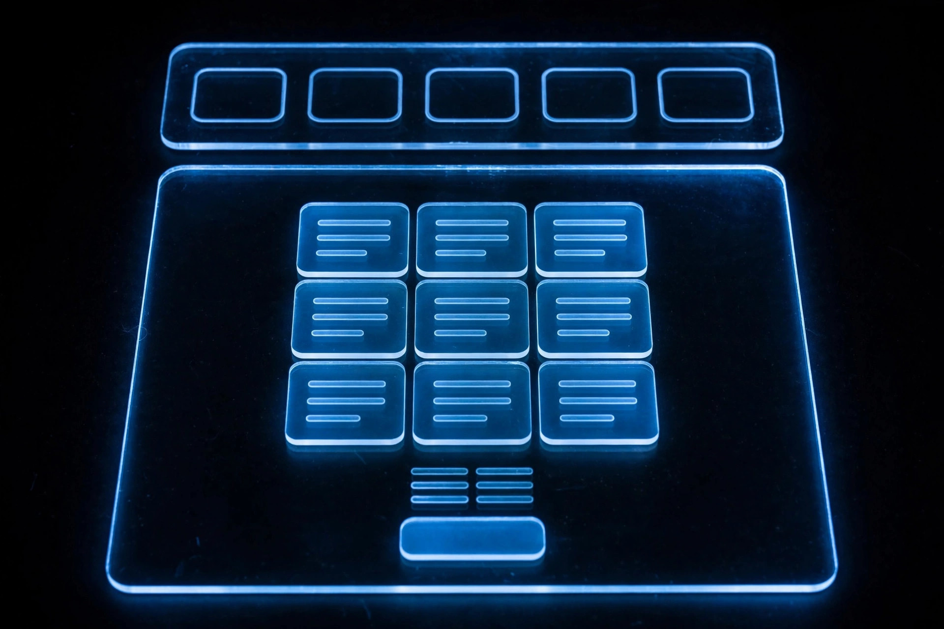
The third habit is common region. Elements inside the same enclosed area are assumed to belong together. A border, a background block, a bar with a different color — any closed boundary creates a group in the visitor’s mind.
Navigation bars work this way. The icons or links at the top or bottom of a phone screen sit inside a bar, often with a border or a background color, and that boundary tells visitors: these belong together, these are the main places you can go. Without the bar, the same icons would float on the screen, each looking like a separate decoration. With the bar, they read as a system.
The same habit works on a wireframe in smaller ways. A box around a single email — subject, sender, and preview inside one border — tells the reader that those three lines are one message, not three separate items. A card around an event — date, title, location, and a button inside one border — tells the visitor that those details describe one event. Borders are not decoration. They are grouping, made visible.
Checking a wireframe with all three
Before I show a wireframe to a client, I run it through these three habits, quickly, as a checklist. Do similar things look similar? If two buttons do the same kind of job, are they the same shape and size? Do related things sit together? Is the button that acts on a paragraph actually next to that paragraph? Are groups enclosed? Does the navigation read as one bar, does each card read as one item, does each section read as one section?
Most wireframe problems I catch at this stage are not problems of taste. They are problems of grouping: a button that drifted away from its paragraph, a card that changed size for no reason, a set of links with no boundary to hold them together. Fixing those on paper takes minutes. Fixing them after a site is built takes meetings.
Your visitors will group what they see. The only question is whether you grouped it for them, on purpose, or left them to guess. Gestalt principles are simply the habit of grouping on purpose.
The next post is about knowing when a paper wireframe is ready to leave paper behind and become digital.
Want your site’s structure sketched before it’s built? Shaun M. Johnson, owner of Signature Web Design is a full service Web designer, SEO, UI/UX, Graphic Design, and Logo and Branding Expert serving Goldsboro, Greenville, Kinston, Raleigh, Wilmington, Wilson and surrounding areas in North Carolina — with websites designed across the country. Get a free consultation or see recent work.
Previous in this series: Information Architecture · Next: From Paper to Digital: When a Wireframe Is Ready for the Screen