

15 Nov Storyboards: Showing a Visitor’s Journey Before a Single Screen Is Designed
Part 2 of Build Wireframes and Low-Fidelity Prototypes — a series on the UX principles I use in client work.
Before I draw a single screen of a website, I sometimes draw a story. Not a design. A story, in panels, like a comic strip: a person, in a place, with a problem, trying to get something done. That is a storyboard, and it is the most human tool in this whole series — which is exactly why it comes first.
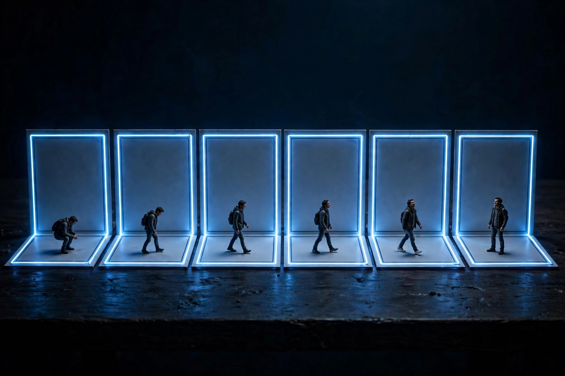
A storyboard is a series of panels or frames that shows a visitor’s experience with a product, in order. It does not show what the website looks like. It shows what the visitor’s day looks like, and where the website fits into it. That distinction is the whole reason storyboards work. Screens tempt you to argue about layout. Stories force you to argue about the visitor.
A real product might have dozens of screens, but a good storyboard focuses on just the most important parts of the experience. Six panels, give or take, is plenty. If you need twenty panels to explain what a visitor does, you have not yet found the core job — go back to the problem statement from the last series and try again.
The four ingredients of every storyboard
Every storyboard, whatever kind it is, needs the same four ingredients. Miss one and the story falls flat.
First, a character: the person the story is about. Not “users.” A specific person, with a specific situation. A parent checking a festival schedule from the car. A first-time church guest wondering what Sunday morning looks like. A donor who just read a story and wants to give, right now, before the feeling fades.
Second, a scene: the environment that person is in. The car, the kitchen table on a Sunday morning, the phone in hand after a social media post. Scene matters because it sets the constraints. A visitor in a car, on a phone, in a hurry, needs a different website than a visitor at a desk with time to browse. If you do not name the scene, you will design for the desk and lose the car.
Third, a narrative: the problem the person is facing, and how the design will solve it. This is the story’s engine. Without a problem, there is no story — just a person tapping through screens for no reason.
Fourth, a plot: the benefit or solution the design offers. What changes for this person because the website exists and works well? They find the schedule. They picture Sunday clearly enough to come. They finish the donation feeling good about it, not relieved that it is over.
Character, scene, narrative, plot. Write those four down before you draw anything, and the panels almost draw themselves. Skip them, and you will draw a very pretty sequence of screens that nobody cares about.
Big-picture storyboards: the visitor’s story
There are two kinds of storyboard, and they do different jobs at different times. The first kind is the big-picture storyboard. It focuses on the visitor: what they need, the context they are in, and why the product will be useful to them. It is used early, often to get stakeholders to support an idea, because it makes the visitor’s experience — including how they feel — impossible to ignore.
A big-picture storyboard starts with a problem statement, then a goal statement: what the product will let this person do, and how you will know it worked. Then you set up the panels, one idea per panel, and you draw the story forward. The first panel sets the scene. Each panel after that pushes the story on, and shows how the person feels along the way — a worried face, a relieved face, a happy face at the end. That emotion is not decoration. It is the point. A storyboard that never shows feeling has not actually told you whether the experience works.
Take a festival attendee. Panel one: a parent in the car, gates opening soon, trying to find today’s lineup and parking. Panel two: they open the site on a phone. Panel three: they find today’s schedule in one tap, not three. Panel four: a worry — last year they could not find parking information and circled the lot. Panel five: this year the parking information is right beside the schedule, clear and current. Panel six: they arrive, on time, feeling like the event wanted them there. That is a big-picture storyboard. Notice how little of it is about screens. Most of it is about a person, in a hurry, being helped or let down.
Use a big-picture storyboard when you need to convince people — including yourself — that an idea is worth building at all. If the story does not move anybody, the design will not either, no matter how polished it gets later.
Close-up storyboards: the product’s story
The second kind is the close-up storyboard. It focuses on the product and how it works, and it is best used in the middle to the end of the design process, once the visitor’s story is already clear. Where the big-picture storyboard asks “does this help this person?”, the close-up storyboard asks “how, step by step, does the product actually do it?”
The first steps are the same: problem statement, goal statement, scenario at the top of the page. Then the panels change. Now each panel shows a product detail and why it matters: the visitor opens the site, logs in or continues as a guest, searches or filters, views a detail, takes an action, and gets a confirmation with clear next steps. One panel per action, in order, showing how each action leads to the next screen.
Take that same festival attendee, close-up. Panel one: they open the site on a phone. Panel two: the homepage leads with today’s schedule, not a general welcome. Panel three: they filter by stage or time. Panel four: they tap an event to see details and parking. Panel five: they save or share it. Panel six: a confirmation-style summary tells them what they just did and what to do next — no dead end, no guessing.
The difference is instructive. The big-picture version taught us the attendee is in a car, in a hurry, and worried about parking. The close-up version turns that learning into screens: today’s schedule first, parking beside it, a clear next step at the end. Skip the big-picture version and the close-up version will happily design a beautiful homepage that buries both. Do the big-picture version first, and the close-up version almost designs itself.
A practical way to start
You do not need drawing talent. Stick figures are fine. What you need is discipline about the panels.
Start with one problem statement and one goal statement, written in plain words. Set up six panels on paper. Write the scenario — one sentence about the person and the problem — at the top. Then draw one idea per panel, in order, and mark how the person feels in each panel. End with the goal achieved, or the problem still unsolved if that is the honest story — a storyboard that shows failure is often more useful than one that shows success, because it shows exactly where to fix things.
Then show it to somebody who was not in the room when you drew it. If they can retell the visitor’s story back to you without you explaining it, the storyboard works. If they start talking about colors or fonts, you drew screens, not a story — go back to character, scene, narrative, and plot, and try again.
The next post takes the story one step toward structure: user flows, which turn a visitor’s story into a map of actions, decisions, and screens — the bridge between “here is what happens” and “here is what we build.”
Want to see your visitors’ story before you build their site? I build and redesign websites for small businesses, non-profits, and churches across Eastern NC. Get a free consultation or see recent work.
Previous in this series: Why Sketch Before You Build · Next: User Flows: Mapping the Path From Landing to Contact, Donation, or Booking
This article is my own take, in my own words, on UX principles I use in client work.