

14 Nov Why Sketch Before You Build: Prototypes in Plain English
Part 1 of Build Wireframes and Low-Fidelity Prototypes — a series on the UX principles I use in client work.
The last series ended where this one begins. We listened to visitors, named the real problem, and generated a pile of ideas. Now comes the part where most website projects jump straight to the finished look — and where I slow down on purpose.
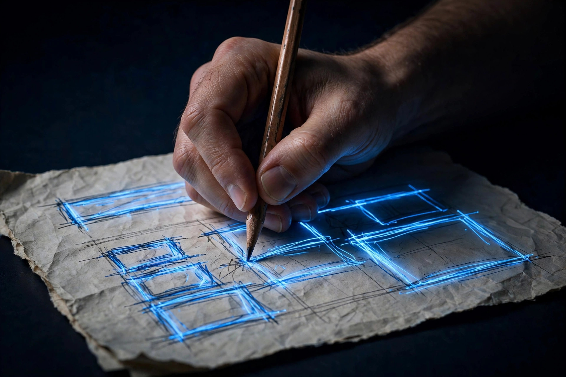
Before anybody builds the real site, I sketch what it might be. Not a polished design. A rough version you can look at, poke at, and argue with, while changing it still costs almost nothing. In UX work that rough version has a name: a prototype. This series is about that stage — storyboards, user flows, wireframes, and low-fidelity prototypes — explained the way I actually use them on small business and nonprofit websites.
If the word prototype sounds like something only big tech companies do, forget that image. A prototype can be paper and pencil. It can be a few boxes on a whiteboard. What matters is not how fancy it is. What matters is that it lets you see an idea before you pay to build it.
What a prototype actually shows
A prototype is a visual version of an idea, at whatever level of finish fits the question you are asking. It shows what the product does at a given moment, what a visitor can tap or click, and how the thing will behave when it is live. It can cover a whole experience, or just one interaction — say, the donate form, or the path from a festival schedule to parking directions.
That is useful for three reasons, and all three save real money on a small project.
First, it turns a concept into something real enough to react to. “A clearer schedule page” is an opinion. A sketch of that schedule page, with the day’s events in order and a big button for today’s lineup, is something a client can point at and say, “Yes, but where does parking go?” That conversation, had on paper, costs minutes. Had after launch, it costs a rebuild.
Second, it surfaces problems while they are still cheap. A prototype exposes the step you forgot, the button that leads nowhere, the form that asks for information nobody has handy. I would rather find those on a sketch than in a live site, when visitors are already bouncing.
Third, it gives everybody the same picture. A client, a developer, and a designer can all read the same words — “make the guest path obvious” — and picture three different websites. A sketch collapses that gap. Everybody is finally arguing about the same thing.
Fidelity: how finished should it be?
One word you will hear a lot in this stage is fidelity, which just means how closely a sketch matches the look and feel of the final product. Low fidelity means rough and simple: boxes instead of photos, lines instead of paragraphs, no real colors. High fidelity means close to the finished thing: real text, real images, real styling.
Here is the rule I use with clients: match the finish to the question. If the question is “does this path make sense?” — does a visitor get from the homepage to the schedule, or from a story to a donation, without getting lost — then a rough sketch is not just good enough, it is better. Nobody gets distracted by colors or photos, so the conversation stays on the path itself.
If the question is “does this feel trustworthy and easy to use?” then you need something closer to finished, because feel is exactly what you are testing. But that comes later. Starting rough is a feature, not a limitation. Rough invites honest feedback. Polished invites compliments, which are lovely and useless.
That is why this series starts rough and stays rough for a while. Storyboards are drawings, not designs. User flows are diagrams, not screens. Wireframes are skeletons, not websites. Each one answers a different question, and each one is cheap enough to throw away — which is the whole point. A sketch you are willing to throw away is a sketch you are willing to improve.
The prototype is not the product
There is one misunderstanding I clear up at the start of every project that uses sketches, because it causes trouble later if I do not. A prototype is a draft. It is an iteration, not a promise.
Stakeholders sometimes see a sketch and treat it as finished, or treat every element in it as a commitment. Managers sometimes show a sketch to a board and then have to explain why the live site looks different. Designers sometimes fall in love with their own first sketch and defend it instead of testing it. All three mistakes come from the same place: forgetting that the sketch exists to be changed.
I say it out loud now so it is on the record for the rest of this series: if a storyboard, flow, or wireframe in this series looks different from the site that eventually launches, that is not a failure. That is the process working. The sketch did its job the moment it helped us find a better version.
How this series fits the work so far
If you followed the last series, you already know the rhythm. First we empathized: we listened to visitors and learned what they actually need. Then we defined: we turned that learning into problem statements, guesses about what might help, and a clear statement of value. Then we ideated: we generated lots of ideas and chose which ones to build first.
Prototyping is the fourth step in that rhythm. It takes the chosen ideas and gives them shape — first as a story, then as a path, then as screens. The fifth step, testing, comes in the next series, when real visitors try the prototype and tell us what still breaks. This series stops just before that test, at the point where the idea is visible enough to test at all.
That order matters, and it is worth naming because it is the opposite of how most website projects run. Most projects start with a layout, then try to fit the visitor’s job into it. This process starts with the visitor’s job and lets the layout earn its place. The sketches in this series are how that earning happens, one visible step at a time.
What to do with this on your own site
You do not need design software to try the first step. Pick the single most important job on your site — the one job that, if visitors cannot finish it, the site has failed. For a festival site, that might be finding today’s schedule. For a church site, it might be a first-time guest figuring out Sunday morning. For a nonprofit site, it might be a donor finishing a gift without stalling.
Now draw that job, badly, on paper. Not the homepage. The job. What does the visitor see first? What do they tap? Where do they land next? What could confuse them? If you cannot draw it in five boxes, you do not yet understand the job well enough to design for it — and that is useful information, not a failure.
The next post takes that drawing one step further back, to before the screens exist at all: storyboards, which show a visitor’s whole experience as a story, with a person, a place, a problem, and a resolution.
Want help sketching your site before you build it? I build and redesign websites for small businesses, non-profits, and churches across Eastern NC. Get a free consultation or see recent work.
Next in this series: Storyboards: Showing a Visitor’s Journey Before a Single Screen Is Designed
This article is my own take, in my own words, on UX principles I use in client work.