

17 Nov Why “Click Here” Is Bad for Your Website
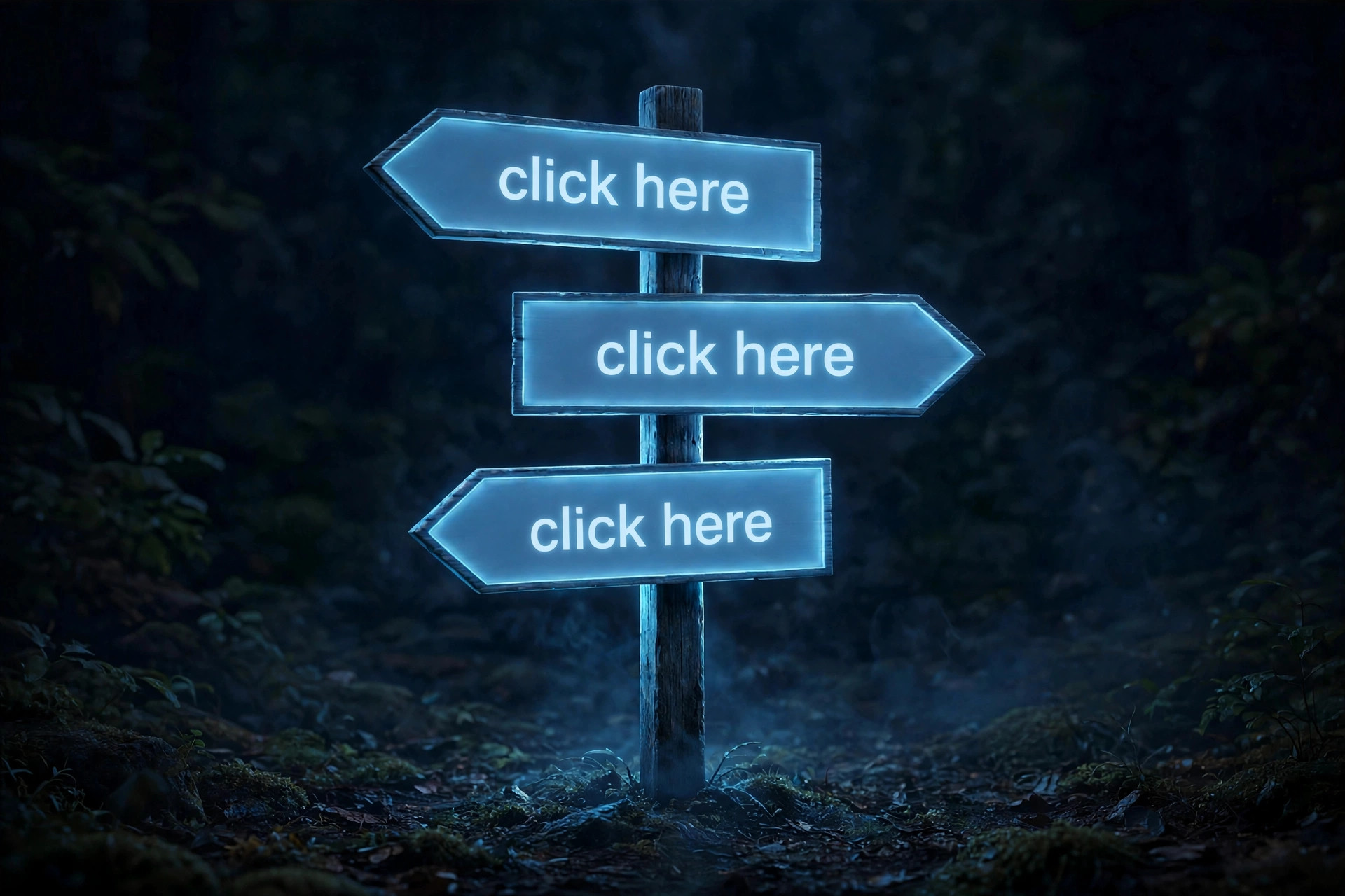
You have seen it a thousand times: “Click here to learn more.” “Click here to download the guide.” “Click here for pricing.”
It feels harmless. It is not. I see it on client websites all the time in my web design work, and “click here” fails at the one job a link has, which is to tell the reader where they are going before they go there.
Your readers do not read every word
People scan web pages. They look at headings, bold text, and links, and they skip the rest. When the only words standing out on the page are “click here” repeated five times, a scanner learns nothing. They cannot tell which link goes to pricing, which goes to the guide, and which goes to your contact page without stopping to read the sentence around each one. That is the opposite of what a link is for.
It is worse for people who use screen readers, and it is one of the clearest examples of why accessible web design matters. Many screen reader users pull up a list of every link on the page and jump through that list alone, without the surrounding sentences. A list that reads “click here, click here, click here, click here” is useless. A list that reads “Download the pricing guide, See our web design work, Book a free consultation” tells them everything.
It throws away free search value
Search engines use link text as a clue about what the linked page is about. A link that says “web design pricing” tells Google something useful about the page it points to. A link that says “click here” tells Google nothing. You wrote the page, you built the link, and then you gave the search engine a blank label. For a small business trying to show up in local searches, that is a gift you cannot afford to waste.
Not everyone clicks
Half your visitors are on a phone or a tablet. They do not click anything. They tap. “Click here” is a mouse word, and every year it fits fewer of the people reading your site. It is a small thing, but small things add up to the user experience a visitor gets: this site was written for someone else, on a different device, in a different decade.
It makes your page longer without saying anything
“Click here to read our guide to small business websites” is nine words. “Read our guide to small business websites” is seven, and every one of them means something. The words “click here” never add information. They are filler, and filler is what makes a page feel hard to read.
The fix is simple
Make the link text the destination. Not the action, the destination.
- Instead of “Click here for pricing,” write “See our pricing.”
- Instead of “Click here to download the guide,” write “Download the website planning guide.”
- Instead of “Click here to learn more about us,” write “Meet the team behind Signature Web Design.”
There is one test that catches every bad link. Read the link text out loud, on its own, with nothing around it. If it means nothing by itself, rewrite it. “Download the pricing guide” passes. “Click here” fails every time.
Your links are the doors on your website. At Signature Web Design, we label the doors.