

17 Nov Wireframes: Paper Sketches to Low-Fidelity Screens
Part 4 of Build Wireframes and Low-Fidelity Prototypes — a series on the UX principles I use in client work.
A user flow tells you the order of the journey. A wireframe tells you what is on each stop. It is the skeleton of a screen: the structure, laid out in boxes and lines, before any styling, photography, or final wording arrives. If a website were a house, the wireframe would be the framing — you can walk through it, see where the rooms are, and move a wall while it still costs nothing.
Wireframes are not the same as prototypes, however, and keeping that distinction clear saves confusion later. A wireframe is a quick, affordable, static, non-interactive design asset. It shows structure. A prototype takes wireframes further, adding interaction — clicking through, in the low-fidelity version this series is heading toward — so somebody can actually try the journey. Wireframes come first. They are the step that makes a prototype possible, not the prototype itself.
What goes on a wireframe
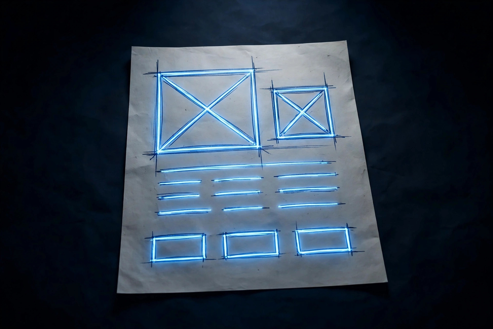
A paper wireframe reduces a screen to its basic structure and highlights what each element is for. That reduction is deliberate. When you strip away color and photography, one decision remains: what belongs on this screen, in what order, and what does each thing do?
On paper, that reduction has a simple visual language. Text becomes horizontal lines — a few lines for a paragraph, one line for a heading. Images become boxes with a large X inside. Buttons become rectangles, sometimes with rounded corners. You label each one with what it does. That is enough. Anybody can read it, and nobody mistakes it for the finished site, which is exactly the point.
Before you draw: a four-step checklist
Before drawing, I work through a short checklist that comes straight from the research and the flow. First, align the research with the project goals again: what is this project for, who is it for, what are their goals, what kind of product is it, and what needs to be delivered? Draw a wireframe without re-checking those answers, and it will faithfully reproduce the wrong priorities in neat boxes.
Second, name the inputs and outputs for each screen. What does the visitor put in — a tap, a search term, a donation amount, a date? What comes back out — a confirmation, a list, an error message, a next step? Defining inputs and outputs before drawing stops you from designing a beautiful screen that accepts nothing and returns nothing useful.
Third, sketch the first wireframes from the user flow, one rectangle per screen. The flow already decided the order. The wireframe decides the layout within each stop: where the heading goes, where the main action sits, what supporting information earns a place, and what gets cut. Sketching lets you connect the site’s structure to its visual design by showing the paths between pages, and it helps settle consistent ways of showing the same kind of information — event details, service times, donation amounts — across the whole site.
Fourth, build the wireframe structures themselves: the boxes for content — text, photos, video — as basic shapes and scribbles. These are placeholders for visualization, not the real content. For instance, a box that says “photo here” is doing its job. A real photo at this stage would only distract from the structural question: does this screen have everything it needs, in the right order?
How to check a wireframe
A wireframe earns its keep by answering two questions, and I check every wireframe against both before showing it to a client.
Are all necessary elements included? Run through the user flow for that screen and tick off every element the visitor needs to complete the task. For example, look for the heading that orients them, the action that moves them forward, the information that reassures them, and the way back if they took a wrong turn. A wireframe that forgets the “what happens next” element is not a small oversight. As a result, it is a dead end in tidy boxes.
Are any elements missing or misplaced? This is the same question from the other side, and it catches different mistakes. If you bury a donate button below three paragraphs of history, it is misplaced, however well you drew it. A schedule page with no parking information is missing something the story already told you matters. A homepage that tries to say everything is not generous. It is unfocused, and the wireframe shows that at a glance, while it is still cheap to fix.
That checking habit is also why wireframes are worth including in a portfolio, for any designer reading this series as a student rather than a client: they show, at a glance, that a designer can plan a complete, well-organized product before a single pixel of styling arrives.
A practice exercise that actually teaches
When designers first learn paper wireframes, a useful exercise is to work backwards from an existing app or site. First, pick a familiar screen and draw its wireframe from scratch — boxes for images, lines for text, rectangles for buttons. You are not copying the design. You are reverse-engineering its structure: what did the designer decide belongs on this screen, and in what order, and what did they leave out?
Try it with a site you use every day. Draw the homepage as a wireframe, then ask the two checking questions. Is anything necessary missing? Is anything misplaced? You will start noticing structure everywhere. In addition, on your own site, you will spot the screens where nobody ever really decided the structure at all. Someone just inherited it from a template and never questioned it.
That noticing is the skill. Later in this series, wireframes move from paper to digital, and then into clickable low-fidelity prototypes. The tool changes. The discipline does not: structure first, styling second, and every element earning its place by helping a real visitor finish a real job.
The next post puts the whole toolkit together on a real project, so you can see storyboard, flow, and wireframe working as one process instead of three separate exercises.
Want your site’s structure sketched before it’s built? Shaun M. Johnson, owner of Signature Web Design is a full service Web designer, SEO, UI/UX, Graphic Design, and Logo and Branding Expert serving Goldsboro, Greenville, Kinston, Raleigh, Wilmington, Wilson and surrounding areas in North Carolina — with websites designed across the country. Get a free consultation or see recent work.
Previous in this series: User Flows · Next: Putting It Together: Storyboard, Flow, and Wireframe on a Real Project